Tuesday, 17 May 2016

Reflection

Personal and professional practice is a module that I have found to be extremely beneficial to me throughout the year, not only professionally but personally too. It has allowed me to experience new things, whilst providing me with new knowledge and skills that I have been able to apply to other modules that I have worked on, mostly Applied Animation.


I feel that one of the most beneficial experiences I’ve had within this module was the visit to Manchester Animation Festival. Not only did this give me the opportunity to see how the industry works and what it takes to become part of the industry, it also provided me with an insight into how to network in a professional manner and what to expect when I begin to pursue my career. It was also at this point that I realised that I wanted to focus on 2D animation, as I liked a lot of the 3D work, but didn’t feel as passionately about it as I did 2D. By realising this, it has helped me to focus my work a lot more this year to produce a showreel that I feel will help me to gain experience in the right area within the industry.

Manchester Animation Festival also opened up my eyes to some personal improvements I need to make. Whilst I have grown in confidence in terms of work and talking to my peers, I still need to learn to talk to other people and professionals, as this was something I shied away from greatly at Manchester. Having said this, I did make a start by talking to Tomm Moore. Doing this was a challenge in itself and it took a lot of courage for me to approach him and I feel that I would benefit from pushing myself out of my comfort zone more and to remember that they are people too and there’s nothing to be scared of. I will definitely work on talking to people outside of my peer group over summer and the next year by contacting professionals over social media and talking to those that interest me at any festivals or events that I attend.


Another aspect of PPP that has benefitted me is the many talks we have had from professionals. I feel that by learning about a range of different companies and what they do and what they look for when they take on new interns has really helped to me to focus my work and figure out what is important to focus on and what isn’t. It has also opened my eyes to the fact that it is okay to experiment and that if something doesn’t work that it is still fine. This, I feel has made me a lot more confident in trying out new methods of animating, such as mixed media, which I have applied to a number of my projects this year.

In particular, I found that the talk from Jan Meinema was very influential to me, as it made me realise the importance of sound design and that it is an area that I want to look into further. This led me to seek out help with learning the basics of Audition, which I will continue to become familiar with over the summer and next year.

Overall, I feel that it has been a very successful year and I feel that I have achieved a great deal of things, as an animator and as an individual. PPP has helped me to find a focus within my practice and I feel that I have gained a great deal of knowledge that I will be able to apply to future projects.

Brand Me: Creative CV

As part of my promotional pack, I have designed a creative CV that I could potentially hand out to studios along with my showreel to help give them a better idea of who I am and what I am interested in. However, having never done a CV before for anything I didn't really know what to do, so I would say that this isn't a very strong CV at all.

Nevertheless, I did it anyway and tried to include information that I feel is relevant to my practice and would be helpful for an employer to have.

CV

I tired to keep the colour scheme and the overall feel of the CV in relation to the rest of my work and I feel that I have managed to keep up that consistency. However, I feel that there is something lacking and I can't quite put my finger on it. Because I don't have long left until submission, I will leave it as it is and seek Mike's advice once this is all over on how to improve this and what it is a need to include exactly. 

On top of this, I put together a little pack that contains a letter head, business cards, creative CV and a DVD case. 

Promo Pack

Overall, I feel that I have created a pack that is consistent throughout and one that will easily be identified as being mine. I am really pleased with how I have managed to brand myself and I feel that done well with the task considering I have never done this before.

Investing in TVPaint

Having decided that I want to focus on 2D animation, I went off and began to research what programs other 2D animation based studios use to create their work. I found that the majority of studios use Toon Boom, Animate CC (Flash) or TVPaint to create work and whilst I have Animate CC, it isn't a program that I am all that familiar with or enjoy using. However, this doesn't mean that I am not willing to learn how to use it, as I feel that it will benefit me to know how to use it. With this in mind, I intend to invest some time in becoming familiar with the program and learning how to use the software to create animations that I would originally have done in Photoshop.

On top of this, I also investigated both Toon Boom and TVPaint, as I thought that it would benefit me to know how to use software outside of the adobe suite. After much consideration and weighing up the benefits of investing one of these programs, I decided to take the plunge and buy TVPaint, as it was cheaper at the time than Toon Boom. It also provided nice little perks such as, having the full license for life at a student price with no extra cost once I graduate and having a commercial license even though it is a student license. I will also spend time getting to grips with this software over the summer to develop my skills further as an animator and to gain new skills that may make animating in the future easier for me, as right now Photoshop is okay for the smaller tasks, but when dealing with a larger animation, it isn't entirely appropriate.

Brand Me: Polishing My Appearence

With my logo created and my business cards made, I felt now would be a good time to return to my social media and polish it up a bit. To start with, I applied my logo to all of the relevant social media sites that I use frequently to create a sense of consistency and to make it clear that it was the same person across all of the accounts. However, when it came to the banner, I didn't want to be repeating the logo, as I felt that it may be a bit overkill and it wouldn't look very appealing. With this in mind, I decided that I would use screen shots of work that I had or was currently making, as I felt that this would reflect what my current interest were and what I was working on to my audience.

Social Media Examples

Looking at all of my social media together like this helps me to notice how much better it looks compared to before. Not only does it feel a lot more professional, but I also feel that this work can now be recognised as mine and that I will now also be recognised as a practitioner, rather than just someone posting up work. Overall I am really pleased with what I have achieved and I feel that my online appearance is a lot cleaner than before.

Brand Me: Business Cards

With my logo made, I though it would be a good idea to get the business cards out of the way, as these would be something that I would use to promote myself at festivals and events. I knew that I didn't want the cards to be overly complicated but I also wanted them to reflect my work and give people and idea of what it was that I did. I felt that the best way to do this was to use snap shots of the work I had been doing over the last 9 months and having them as the front of the card. I also tried out using just my logo on the front, however, I wasn't a huge fan of this, as I felt that it lacked something compared to the ones where I had used my work.

Design one
Design two
Design three
Design four
Design five
Design six

With this in mind, I focused on how the back of the card worked with the front and asked my peers to give me suggestions on the designs. They suggested that the darker background worked better with the forest scene on the front than it did the wolf, and that this one worked better with the white. I agree with what they have said and feel that those arrangements work the best together. 

However, I'm not quite sure which design I want to choose as my final one, so I may end up printing of both designs. This way I will be able to showcase a wider range of what I do and have a littler variety.

Final Designs

Brand Me: Visual Identity

In order to create a visual identity for myself, I need to create a logo that represents me as a person and reflects my practice. Logo design is something that I struggle with greatly, so this was a very difficult task for me and probably caused a lot more frustration than it should have done. I spent a very long time trying to figure out whether I wanted a picture within my logo, or if I was just going to have it as my name.

To begin with, I toyed around with the idea of having a symbol that related to storytelling and the heroes journey, as narrative driven animation is what I enjoy doing the most. I also thought that it would be a nice little conversation starter, as it would be something that only I knew the meaning of. However, I was also aware that this may cause confusion amongst people and decided against it in the end. This meant that I was back to square one and I had no idea where to go from here. So I went basic, I started with my name and it suddenly dawned on me that my initials spell out ELM. I double checked to see if ELM Animation wasn't already taken and it didn't appear to be so I decided that this would be a nice identity for me, as it was simple and clear. Not only this, but the logo would be simple to animate as an ident, as it is just letters.

Idea gen
Idea Sketches

After sketching out some ideas, I found that preferred the lettering inside the box with 'animation' written smaller underneath, all that was left was to figure out what font I wanted to use and what colour scheme to go with. I wanted the font to be clean, but also reflect my work, however, I found that after looking at a few, I preferred the cleaner fonts and felt that they looked more professional and they were overall nicer to look at.

Fonts

With the fonts chosen, I began to think about colour and decided that I would go for a shade of blue, as it is my favourite colour, I didn't really put much other thought into it. However, I had noticed that a lot of my peers were choosing blue for their colour schemes, so I decided to go for a darker shade, as I hand't seen this being used as much. 

Final Logo

Overall, I'm really pleased with the overall outcome and I feel that I have done a good job considering that design isn't one of my strongest suites. During the task, I learnt that simple is often much better than complex and when designing an identity for yourself it is important to create something that has the ability for various applications.

Brand Me: Reviewing my Current Online Presence

As it stands, I currently operate a fair number of social media accounts. However, there are obviously some that I pay more attention to than others, for instance, I am very unfamiliar with Tumblr so I tend to only post to this through Instagram. Whilst this is good and all, it also means that there is a lot of the same work across all of my social media, so if you've seen one, you've seen them all. After the talk with Martin at the start of the year, I've realised that this isn't a good thing, as it results in less publicity and people becoming bored of the content you are posting. With this in mind, I have decided to review my social media and designate at least of them to purely finished work and the others to ongoing work and 'teasers' (if you like) in an attempt to draw in more of an audience.

Before I can do this though, I think it would be wise to review the look of my social media and develop an identity that I can easily carry across all of my accounts to create a sense of continuity and consistence throughout, so people will know that it is my work regardless of which site they go to.

Current Social Media Examples


Currently, as it stands, my online identity is all over the place and I definitely need to sort this out and tidy it up so it looks more professional and reflects me and what I do. In terms of how many social medias I use, I feel that I use a reasonable amount and that I don't necessarily need to cut down, however, like I said before, I definitely need to organise them in a way that will draw in an audience better.

With this in mind, I feel that the best approach would be to create an identity first and re-visit this once I have managed to successfully brand myself.

Monday, 16 May 2016

Fettle Animation Studios: Zane Whittingham

Zane Whittingham is a director at Fettle Animation, as 2D animation studio based in Yorkshire. Zane came in to talk to us about what it was that the company did and to show us some of the work that the company had created. it was really nice to have someone so local come to visit and talk to us, as it made me realise that there are plenty of good animation studios in the local area, and that I don't have to move away in order to get my foot in the animation industry. He also told us about how sometimes you don't always fit into a company the way you thought you would and that is okay because whilst you might not work well within that company, you will excel at another and it was reassuring to hear that not many people get a secure job the first time around.

However, whilst I found his advice very helpful and calming, I also realised that I wasn't a huge fan of the work that he was producing. Because a lot of the work Fettle produce is broadcast on children's television such CBBC, there has to be an educational element to it, and it is the same for any of the channels, such as channel 4 and CITV. Whilst I enjoy creating narrative driven stuff, I found the work to be quick boring, repetitive and somewhat patronizing and it has made me realise that children's animation, particularly the kind that Fettle work in, isn't necessarily what I want to create. However, if I was offered an internship I wouldn't turn it down, I just don't feel that this kind of storytelling is what I would like to personally explore.

Pitch Perfect: Pitching our Company

The day before presenting, we decided to plan out who would be talking about what and when. We felt that this would help to minimise the risk of people stumbling over each other and interrupting. This meant that, as studio director, I would open up the presentation by introducing the company and stating which role I played in the company. We had decided that we should each talk about our roles and to speak when the slides relevant to that role appeared.

I feel that this was very good idea and helped to appear organised and professional, it also meant that no one was interrupting the other and we each had a small bit to speak about, so we didn't end up with team members who simply stood there not doing anything. I felt that we dealt with the presentation very well and we were very prepared beforehand, which helped to make it a success.

In terms of feedback, the majority of it was very positive, the only this that was criticized was the small stray pixels that surrounded our logo. Mike felt that the pixels may be misinterpreted as accents and people could possibly try to pronounce our name differently, and suggested that we simply remove them to reduce the risk of this happening. Overall, I am very pleased with what we have achieved as a group and I feel that if we wanted to take the company any further, we are in a very comfortable position to do so.

Pitch Perfect: Working out Finances

In order to prep for our presentation, there was still the task of going deeper into our finances and working out how much we would need as a start up cost for our company. So Lauren, Joe and myself got together and began the daunting task of working out finances. We hadn't really thought about such things as business insurance, so we started here and I quickly took a questionnaire on GoCompare to get a quote, however, when I had finished, they wanted to ring us rather than quote something over the internet. This was very frustrating, but we eventually found an estimate figure from Google and used this in the overall costs instead. We then added this to the other costs we had taken a note of early and began to tot up the total.

GoCompare Quote

Lauren took all of the costs we had gathered and placed them into Mike's 'Cost of Living' spreadsheet to present our costs in a clear manner. We also thought that this would help us to work out the tax, as none of us had any idea how to do it or how it effected our overall costs. However, even with the help of the sheet we were still confused at the end and had no idea how tax payed a role in anything, so we ended up with two separate starting up costs.

Finances

Pitch Perfect: Finding a Studio

Finding a studio was a lot harder than I thought it would be. This was because we had no idea where we wanted to be situated, or what kind of costs we should be looking at. To start with, Joe suggested that we should look into London, as it would provide much better networking opportunities and this may be worth the extra money we'd have to pay. However, after looking at the studios in London, we realised that it was extremely expensive and not suitable for a starting business.

This led us to keep the search local. After looking for quite a few hours at a number of different studio spaces, we decided, as a group, that we liked the look of Duke Studios based here in Leeds. Although Duke is a shared studio space, there was potential to set up a separate studio that would allow to work in private, but we would still benefit from being able to network right on our doorstep with other creatives in the building. Not only this, but the prices seemed fair and there was a lot included within the montly cost of the studio, such as Wi-Fi and bills.

Duke Studios Prices

As we wanted to be quite accurate with our finances, I decided to email Duke to see how much it would cost to rent out a 4 person studio space. They responded very quickly and we found that we would only be paying £480 pm, which we felt was a very good deal for the services that we would receive as part of this offer. 

Emails I sent to Duke
Not only this, but we felt that the location was also a good choice, as we all familiar with the surrounding area and there are a number of animation studios that are quite close by that we could network with. 

Pitch Perfect: Team Roles

Whilst we were discussing which area within animation we would like to focus in, I brought it up that we should each hold a head role of a certain department/ section of the company to help spread responsibilities and encourage an easy flowing system within the company. Ciara immediately expressed an interest in communications, so she took the role of chief communications officer. Lauren wanted to focus on social media and getting the business noticed and took the role of marketing manager and Joe fancied a go at finances so took the role of chief finance officer. I personally took on the role of studio director, as we felt that it would be good to have someone who had a final say on projects and kept production running smoothly.

Whilst we each had individual roles within the company, we had all agreed to focus on the production of any animation that we created, with Joe and Lauren wanting to focus on pre-production and production and Ciara and I on production and post, but we made it clear that we were all flexible and could take on any task.

I feel that we have made good choices with our role and having people in charge of important things such as finances and marketing will help to keep the business running smoothly, as people are aware of their responsibilities.

Pitch Perfect: Branding the Company

Whilst other memebers of the team were off doing other tasks (Ciara was looking into business cards, Lauren social media and Joe finances) I had the job of designing the logo. I must admit that this isn't one of my strongest suites so I took the opportunity to try and develop upon that. With us deciding that we should go with Pixel Pocket as our companies name (we decided upon this after we had all created a list of names relating to narrative and heroes and in the end we liked the sound of something pocket and ended up at Pixel Pocket) we had agreed that the logo should revolve around a pocket, as it could be used as the 'o' in pocket, but it would also be recognizable on its own too.

With this in mind, I asked everyone to sketch out some initial ideas of what they wanted to see in the logo, however Lauren was the only one did this, but it wasn't an issue as it gave me a starting point to work from.

Lauren's sketches
Lauren's sketches

From here I was able to come up with a few other sketches that I then showed to the others, who chose from my design and told me which they'd like to see developed more.


Sheet 1
Sheet 2

Sheet 3
Developed Designs

I feel that I have managed to handle this task quite well, considering that I am not very good at working quickly on designs, as I struggle to come up a variety of designs. Everyone seemed happy with my design ideas and no one placed any concerns about the aesthetic, so I assumed that they were successful. Having said this however, I did struggle with the colouring of the logo and Joe stepped into help. When he did this, he re-designed the logo completely, and whilst I felt that his was a much better design and was a lot cleaner than mine, I couldn't help but notice that none of my teams members had brought up any issues with what I had done, and it made me realise that perhaps communication between the group wasn't great.
This led me to begin asking for individual responses to try and get everyone involved and having their say, as I didn't want anyone in the group to feel as though they didn't have a say in any area of the company. 

Joe's Design

As a team, we agreed to go with the green/ blue design, as we felt that this portrayed us a company the best. I feel that the overall outcome is very clean and clear and it looks very professional.

Dave Alex Riddett: Director of Photography

Dave-Alex Riddett is a director of photography at Aardman Animations. Whilst his focus was in stop motion animation, he also talked about all of the work he had done prior to Aardman and it was really interesting to see all of the different kinds of stuff he had dabbled in. His focus wasn't particularly in animation, but more film. however, I still learnt a lot from him in terms of camera direction and how to think dynamically and creatively when thinking of shot framing within my own work.

During the talk Dave spoke about how we should't be afraid to experiment, because even if something turns out worse than we anticipated, remember you 'can't polish a turd, but you can roll it in glitter'. Putting the fact that this was an extremely funny comment aside, it was nice to hear that he himself had made plenty of mistakes throughout his career, but he has still ended up on top. This is something that I struggle with quite a bit, as I can become quite fixated on making things look perfect, which can often lead to me focusing more on the visuals over everything else, ultimately leading to my work not being very strong in some of the more important areas. Hearing that Dave himself has done his fair share of experimenting and made numerous mistakes has made me realise that it's okay for something not to work and that it doesn't mean it's a failed attempt, but rather it is a learning experience and it is something that develop me as an animator.

On a different note, it was really interesting to see the inventive solutions that Dave had come up with during his career to get over particular hurdles during production. For instance, in Wallace and Gromit: The Wrong Trousers Dave showed us some bend the scenes footage of how they had set up the camera to track the characters, back when camera rigs and cameras were huge things that reduced accessibility to sets and characters. Lighting was also touched upon, it is important to light a set correctly and think about all the subtle details, like how light would react when shining through a window and so on. The right camera placement and the right lighting can help to create a much more dynamic and interesting shot.

I feel that there were definitely some helpful tips that I took way from Dave's talk that I will be able to apply to all of my future work and I really enjoyed hearing what he had to say.

Sunday, 15 May 2016

Pitch Perfect: Researching Competition

With the group set up and our focus settled, I thought it was a good idea to begin researching other animation studios that also had a focus on narrative driven animation to gain inspiration as to how we should approach the field as a company. I wanted to find out how other animation companies, both large and small, made themselves unique from one another and how they presented themselves to their clients.

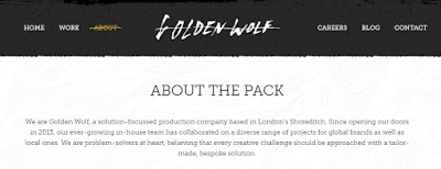
Golden Wolf
Golden Wolf was the first animation company that I thought of when I thought of the words fun and creative. I really like the way this studio creates a variety of unique, interesting and engaging animations for their clients and it is something that I feel, as a company, Lauren, Joe, Ciara and I would also strive for,

Golden Wolf selection of work
Ethos

Golden Wolf work for a variety of clients, from musicians to big name companies such as Nike. They have a very broad range of animation techniques under their belts, however, these don't stray from the overall aesthetic and tone of the company. Rather than focusing upon a certain element within animation, such as narrative driven animation for instance, they take on a range of projects and use animation as the tool to achieve their goals. Having said this, their work is predominantly 2D animation, yet they do branch out to 3D if it suites their ideas and solutions.

Blue Zoo
Blue Zoo is a London based animation company that predominantly works in 3D, however they focus upon character and narrative driven animations. They strive to make quirky, fun and lively characters and have won multiple awards for their work. 


Ethos

Blue Zoo work on a variety of different character led projects, from long form children's TV series to animated shorts and apps taking the idea all the way through to a finished outcome. 

Kilogramme
Kilogramme is a 2D and 3D animation company based in Manchester that work with their clients from 'initial ideas and concepts, right the way through to the finished product'. 


Ethos

Studio AKA
Studio AKA are an award winning independent London based animation studio and production company. They are a large company who are known internationally for their work on a number of projects that range in style, focus and technique. 


The company engages in a number of animation techniques rather than limiting themselves to any one in particular, and I found this quite strange, as the previous companies I have looked at so far seem to have had one technique as their focus with the capability to branch out. However, being a large company may provide them with more of an opportunity to branch out, as they have the numbers to do so, but as a small company, I feel that this is something the others and I should avoid for the time being. 

Distant Future Animation Studio
Distant Future is a specialist 2D and 3D animation company with a definite 'emphasis on creative'. They strive to make innovative and unique animations for a range of clients and purposes. 


Wonky Films
Wonky Films is a full-service, high end animation studio that specialises in 2D character animation. They work on a wide range of projects for both TV and mobile. 


Martin Agency
Martin Agency is a large company that creates a range of work that leans more towards advertising. I decided to look at this company because of their Wonderfilled campaign they did for Oreo. I really enjoyed this advertisement and felt that this was something that our company would strive to achieve if we were to create something for advertisement. 


Adam&EveDDB
Adam&EveDDB are responsible for creating the The Bear and The Hare Christmas advertisement for John Lewis. This is an animation that I admire and love to watch, so it was only natural that I sourced out who created it. 


They focus primarily on working for clients who are interested in commercial work but have created a few pieces for charity, and although some of their work in animation based, they also create illustrative work and the majority of their video work is live action. 

Sun and Moon Studios
This is a high-end 2D and 3D animation studio based in Bristol. Although the founders of the company were originally focused on 2D traditional animation, the company has since branched out and uses a range of 2D and 3D techniques to create animations that focus on character. 


Although the company was only formed in 2008, they have already worked for big name clients such as the BBC, E4 and Aardman. 

Brown Bag Films
Brown Bag Films is an Irish animation company that appears to create work predominantly aimed at children and have worked with some of the world's biggest entertainment names such as Disney, BBC, Nickelodeon and more. 


From what I have seen, it is clear that the majority of animation studios usually adopt a specialist method and use this method on a range of projects from animation shorts, children's animation and film to TV commercials and info-graphics. Having said this, this seems to apply mostly to the smaller studios, as larger studios tend to branch out with different techniques and have a wider range of methods to showcase. This has reassured me that, as a small company, we should attempt to focus our method and apply it to a variety of different briefs. 

In terms of how the studios present themselves online, I found that some of the studios web layout was a little confusing and I noticed that some looked less professional than others. For instance, I am not a huge fan of Studio AKA's website, as I felt that there was too much going on all in one place. Golden Wolf on the other hand, I feel, have a very professional, user friendly webpage that links in with the tone and aesthetic of the company and the work they produce. They also have a very strong online presence, which all links together nicely. I feel that this is something we should aim to achieve as a company, as this will make our brand stronger and easily recognisable. 

Pitch Perfect: Getting Started

Lauren, Joe, Ciara and I decided that we would work well together as a group to create an animation studio. I feel that this was a good choice to make, as it will allow the company to engage in a wide range of projects and briefs that range from commercial work to narrative driven work, as each one of us is interested in a different element of animation. Not only this, but we all feel that we share a similar work ethic and we share a similar interest in ideas and media preferences.

At first we believed that going broad in terms of technique was a good idea, as we felt that this would make us very appealing to clients, as we were practically saying that we'd do anything. However, we soon found ourselves struggling, as we had given ourselves too broad of a variety to work with, which made it very difficult to decide on what we were and what we wanted to achieve as a company. So we sat down and made a list of what we were interested in individually to compare our interests and focus on the similarities. We found that 2D animation was a common factor amongst everyone and decided that we would predominantly focus on 2D animation, but also state that we could create simple 3D work as well. We also found that Photoshop and After Effects were the key programs that we used as a group and decided that these would be the programs we would initially specialise in. In terms of production, we decided that we would take on all aspects of production, as this would make us more desirable, as we could lead clients through a project from start to finish, rather than having to rely on other production companies to send clients our way.

Once this was done, we started to think about what type of animation we wanted to focus on, whether it would be commercial animation, animation for children, etc. During the discussion we brought our interests and passions forward and it was clear that we all had different areas that we wanted to focus on. Ciara was particularly interested in creative advertisements that used animation in a creative way to get their point across. Whereas, Joe and I were both interested in storytelling. Lauren on the other hand was at a complete loss as she felt that she was interested in too many aspects of animation. so she finally decided that she simply wanted to create and wasn't bothered as what it was, so long as it was creative. In the end we agreed that we would create work that was narrative driven and portray ourselves as storytellers who are 'serious about having fun'.

Getting to grips with Audition

After Jan had visited to give us a talk on sound design, I got in touch with workshop support and asked if they would be willing to give me a basic tutorial in how to use Audition. They were more than happy to oblige and agreed to run through the basics with me.

I found the session to be really useful and I learnt how to set up a multi track and how to import the footage that I wanted. When setting up a multi track you have to set up a new session and you can either use a pre-existing preset track or start from scratch. Tom and Jamie advised me that a clean track might be easier, as it will allow me to add my own effects build upon them, rather than starting out with pre-made effects. With this in mind, they informed me that I should probably stick to 48000Hz and 24 bit if I wanted a 'pro-sound'.

Because it was only the basics, I didn't learn much about blending the sounds, however, I did learn that I should alter the volume of the sound directly, as this damages the original soundtrack, but rather I should adjust the sound using the effects under the equalizer tabs. In terms of blending Tom and Jamie told me that I should be focusing on looking at the effects under filtering and EQ, as these will help to layer the sounds cleanly.

When adjusting the volumes of the sound, it is easier to do so in the mixer first, as this means that  can come back to the multi track and move things around if I need to. They also pointed out that if I do chop a sound clip to put a fade on at the start to reduce the click that would happen if I didn't have that there.
They ended by telling me a few tricks to help clean up audio such as the De-Esser tool, which minimises the 'ss' sound that some people make. There's also a notch filter which can be used to remove a certain frequency within the sound clip if you can find the frequency that it is on.

Overall, I found this tutorial really useful if not a little bit overwhelming. Audition is a big program that has the ability to many different things and it will take me a while to become familiar with what can be achieved with it. Having said this, I feel that I have a basic understanding that will get me started and Tom and Jamie have encouraged me to go back to them when I want to learn something more advanced.

Sound Design with Jan Meinema

Sound within any form of visual narrative is extremely important, as it makes things believable and makes the audience comfortable. Not only that, but it also helps to envelope them and become part of what they are watching.

In terms of animation, it is important to remember that the sound/ music should be found for the animation rather than just choosing music that fits to the animation, as it plays a very significant role in the overall experience that the audience has when watching the animation. Jan Meinema is a Senior Lecturer at Bath University who has worked upon a number of works including an upcoming feature film called 93 days.

Sound within animation can be used to take over the visuals and reveals the things that don't necessarily need animating. Not only this, but sound can be used to transport people to a different world, a place that isn't real. It can do this by varying the qualities of the sound. For instance, if you were to adjust the spatial qualities of the sound you could indicate to an audience that the character is in a wider environment, despite the fact that the camera is focused on the direct environment. Or if you were to adjust the spectral qualities, you could shift the focus from the bigger picture to one individual. Not only this, but sound can be used in other ways to help support a story. Sound doesn't always have to follow the point of view on screen and when it doesn't, it can extremely powerful. For instance, in Once Upon a Candle by the Animation Workshop, the candle drops down into the draw and hides himself away when he learns of his fate. However, the sound doesn't remain outside of the draw as the shot does, but rather takes on a dimensional shift to create a sense of where the candle is and to help set the scene for the audience.


It's not just the main soundtrack/ speech that makes an animation however. Foley sounds are just as important when it comes to creating a successful animation. Foley sounds help to make the whole thing more believable, the more subtle they are the more believable it is. Not only this, but they can help to give characters that don't talk identity. A great example of this is the fairy in Pan's Labrynth. In the scene when Pan meets the stick insect on the rock for the first time, the foley sounds that were used for this particular character are very strong and give a great example of how such sounds can be used to aide the telling of a story and also setting the tone and mood of a situation. 

(I couldn't find the actual scene, but the fairies are in this one too)

Jan ended the talk with giving us some useful tips when adding sound to our own work. First we should remember that the sound we choose should be being used to help communicate meaning and themes. To get it right, sound ideas should be engaged with during the writing of the script, this way the sound can develop alongside the story. When blending sounds, recording sounds at different perspectives to then blend together helps to create a wider perspective and makes the environment feel more believable. Foley sounds not only help to give characters identity, but they also act as signifiers that help to set the environment. 

Overall, I found this talk extremely interesting and beneficial to me, as I feel that sound within my work isn't my strongest point, yet I was unaware of how to go about making it stronger within my work. However, after listening to the tips that Jan has kindly given us, I feel that my sound design will be a lot stronger within future projects. It has also encouraged me to look into learning how to use Audition, as this is the software that will help me to create good quality sound. 

Lip Sync 101


Lip syncing doesn't have to be a daunting task. In fact it can be quite a pleasant experience as I found in Martin's lip sync lecture. Rather than focusing on each letter formed in a word, you can actually only focus on the phonetic sounds of that word and build your speech around that.


Martin pointed out that when you are animating speech you don't have to animate every punctuation shape, as this can make your lip sync appear out of sync and unnatural, however, it is important that you animate the vowel shapes. The shape of the mouth is also important, as it is the shape that forms the sound and this usually comes before the sound, so it is also helpful to offset the sound by a couple of frames later, as this will help you to keep everything in time. 

As a tip Martin also told us the importance of exposure sheets and encouraged us to use them if we ever do lip syncing, as they help to plan out speech to a given track in a way that everyone can understand. 
Overall, I found this lecture very useful, especially since I will be lip syncing in my Applied project. It was really useful to know that you can use replacement frames within After Effects for lip syncing and that it is as simple as selecting which frame you'd like visible for a select period of time. I'm confident that I will be able to successfully lip sync with what I have been told and I am eager to test it out. 

Kahlil Gibran's The Prophet


Recently I happened to watch The Prophet, an animated film adapted from the book of poems, which shares the same name written in 1923 by Kahlil Gibran.


Whilst watching the film, I noticed that the main plot was created using a mixture of 2D and 3D animation, and whilst I am all up for mixed media, I did feel a little uncomfortable at times watching the hair of the characters move, it looked a bit strange and made me a little uncomfortable at the best of times. However, that is not why I enjoyed the film. 

During the film, when the characters are speaking the poems from the original book, the animation changes to that which was created by one of the many animators that were a part of the making of this film. Each poem was animated by a different animator and it was really nice to see such a variety of animations all in one place. Having said this, I wasn't a fan of them all, but it still made it an interesting watch. 

There were a wide range of different techniques and they were all beautiful. If anything, this film has only made me want to explore mixed media more within my own work, as I find that it can make something that is very visually interesting and beautiful to watch.

Green Screen Tutorial: Part Two - Using Keylight

Following on from the last tutorial I had on using a green screen, Matt showed us how to edit the footage we had gathered using Keylight in After Effects. The process was surprisingly easy if you were familiar with masks and how they worked and I found that I was able to complete the task very quickly so I asked Matt how to include shadows once I was done with the primary task.

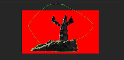
After importing the image sequence, setting up for using chroma key was as easy as dragging the Keylight effect onto the composition and working on from there. To start with we masked around the object to eliminate the screen, however, there was still areas of the screen that were visible.

Masking
Selecting Screen Matte

To solve this, I adjusted the view of Keylight from final result to 'screen matte'. This allowed me to look at my composition in black and white. This allowed me to see where the mask was effecting and where it wasn't and it was easier for me to adjust the curves of the composition to expand the reach of the mask and cover as much of the background as possible. 

Adjusting Screen Matte using Curves
Result of adjusting screen matte
Result

From here I was able to mask out the background and replace it with my own. However, I had chosen a background with clouds, so I went and added a further mask, which I set to 'subtract', so that section of my object would allow clouds to show through to make it fit in with the background more. 

Second Mask

Overall, I found this session very useful and I am confident that I would be able to use a green screen in my work if I needed to and edit it properly. I also found the task quite fun and I would like to be able to use a green screen at some point in the future. 


As I had finished before everyone else and still had time to ask Matt things, I asked him how I would go about adding shadows to the fins of the windmill as it was turning. He suggested that it would be best to add another mask that would create the shadow (using curves for the correct colour/ shading) and use the feathering tool to soften the edges of that mask. 

Creating shadow

Whilst I found this extremely useful to know, I didn't bother animating the mask, as I didn't feel it was necessary for a test, but I do know how to do it and I will use it if the situation ever arises.

The Mill+: Marco Polo Title Sequence

Whilst thinking about mixed media and unusual media within  animation, I started to think about animations that I have seen that have stood out to me and made an impression. I'm not great at recalling things like this off the top of my head and I usually have to look back at lists and things before I can find anything relevant, however, this time I instantly thought of the opening title sequence for Netflix's Marco Polo and I wanted to learn more about how it was made because I feel that it is something I would love to attempt myself at some stage.


I found that it was created by a team working for The Mill+, an extension of the The Mill, which is a studio that creates a variety of visual narratives. The sequence was made using sumi-ink and a thick paper stock that allowed water to sit on the surface. Using droppers, the team placed the ink onto the pre-drawn water paths, which spread beautifully. This was captured with high speed photography, and as the ink spread relatively quickly, they used higher frames rates, so they could control the speed later in post-production. The majority of the ink was shot in-camera and a 2D compositing team added in the wider shots seen within the sequence.

The overall effect resulted in a very beautiful and unique animation that isn't very common to see. Although I want to give something like this a try,  the process seems very technical and a lot has gone into making the sequence and it isn't as straight forward as it appears. However, it is still something that I would like to give a go in the future, even if it isn't as advanced as this.

Manchester Animation Festival: Animation Screenings

Whilst at MAF I attended a number of animation screenings that showcased student animations to animate shorts created by professionals. As with Bradford's festival, I found that I enjoyed this most over anything else I did, even though I did find the talks to be extremely useful and interesting this year.

This year, I felt that there was a large range of animations that used mixed media, rather than one medium. This is something that I have never really considered using within my own work much. However, having seen shorts like Edmund, which used 2D animation over stop motion to crate facial features, it has made me realise that mixed media can be used to create really interesting work and it can be successful too. It was also nice to see what was being created on an international scale and I found that death was a very dominant theme within this years selections. I'm not sure how I feel about that, having been a little uncomfortable at times at how dark some of the animations were, having said this, I assume that this was the intention behind the animations, so they worked really well.

Overall, I saw a range of animations that used a variety of different techniques and media that have all encouraged me to branch out from using just digital animation and try my hand at mixing medias and they have reminded me to not be afraid to experiment.

Barry Purves

Barry Purves is an animator with a background in theatre who works predominantly in stop motion animation. I really enjoyed meeting Barry (again, as he was the person to hand me my award at MAF), as his talk focused on the telling of stories through animation, which is something I have always been interested in myself, so this held a lot of personal interest for me.

He had a lot to say about why we tell stories and he believes it is because we want to be noticed and we want to be remembered. He also believes that stories are something we tell when we don't have a mask to hide behind, as we can use the characters within that story as our mask instead to aide us in the storytelling. When telling a story you should strive to find a mask that liberates you to help you tell your story in the best way possible.

With that in mind, he went on to tell us how playing with the structure of a story is something that we should embrace rather than shy away from. By embracing the artifice, it allows you to think of different ways to tell your story other than in a straight forward fashion. If you are able to avoid using a straight forward structure, it will help create a good story. Finding the right language to tell your story will help to make it more believable to an audience and will also help you to emotionally connect with the audience, making them feel like a part of the story.

During his visit, Purves showed us a number of animations he has done throughout his career. However, the one that stuck out to me the most was Plume. The short is about surviving a trauma and embracing change after trauma, but it was not the story line that drew me into this animation. It was in fact the way that Purves had managed to tell the story with only a few puppets and light. Whilst watching the short, Purves reminded us that we should considered absolutely everything when telling a story through animation, as everything (lighting, colours, editing, etc) tells the story. Not only this, but the characters within the story and how they are designed are also important. One of the most important features of a character are its eyes, as these are where all of the emotion is kept, and this will help you to tell your emotional story and tell the audience how the character is feeling.


Still from Plume

The number of characters also has an effect on your story. If you can, you should cut the number of characters and keep them to a minimum, as this will help to keep your story clear and the audience won't get confused. When it comes to movement you should always think dynamically, as movement also tells our story. For instance, if you wanted to create an eerie, disturbing atmosphere surrounding a character, as good way to do this would be to make his movement 'janky' and have them blink out of sequence. 

Overall, I found this talk to be extremely beneficial as I have learnt a lot about visual storytelling that I hadn't even considered before. The key things that I have taken away from this is that storytelling isn't just about what happens, it's about how you tell it too. Finding the right language to tell your story plays a significant role in how an audience will respond to what they are seeing. And finally, I shouldn't be afraid to embrace the artifice or play around with the structure of a story, as these things can make a story stronger if done successfully. 

Friday, 13 May 2016

Green Screen Tutorial: Part One - Setting up a Green Screen

Today we had a very basic tutorial in how to set up a green screen using the classic lighting theory. This is created by using 3 point lighting, which consists of:

Edge Light: This acts as the sun and is the strongest light.
Key Light: This acts as the bounce back and isn't as strong as the edge light.
Fill Light: This is the light that is used to balance out the shadows and create the overall mood and tone you are trying to achieve.

When lighting your object, you want to try and achieve 3/4 back lighting or the Golden Hour as it is commonly known as, if you are wanting to achieve a natural looking light for your project. However, different lighting can create different moods and atmospheres for instance if you wanted to set up a night scene, it may work better if you were to only use the edge light to mimic the moon's light. This is why it is important to set up your lighting before you do anything else. The placement of the lights is also important, as this will help to create an even spread of light. The edge light is placed in one corner of your stage with the key light placed opposite to act as the light that would naturally bounce off of other objects. The key light can be replaced with a reflector, however it is better to have control over the intensity of the light. The fill light is then placed where it will help to balance out the shadows and the screen light is placed facing the screen where it won't effect the lighting of the subject. This light should be around 50% to help create an even colour on the screen.

Green screen setup


On top of this, it is important to remember to set the camera up at eye level unless you are looking up or down. It is also useful to try and fill the screen with as much blue/green around your object as possible, as this will make it easier in post-production to remove the backdrop.

Using a green screen is something that I've always known about but never had the knowledge to use it. But I am now confident that I ever have the need for a green screen, I will be able to successfully set one up appropriately to achieve what I want.