Thursday, 18 May 2017

Position Statement

I am a passionate 2D animator with a love for exploring narrative and character driven stories that indulge a viewer in a world of imagination and wonder. I take my inspiration from the world around me and attempt to incorporate the natural beauty of nature into my own work. My passion lies behind creating work both traditionally and digitally, and with an eye for detail, I like to pay attention to the subtle movements of my characters. As an animator and an artist, I appreciate the value and importance of drawing and I’m constantly practicing to build upon my skills and learn new techniques. Although I predominantly work in 2D media forms, I also possess skills within 3D as well. My ambition is to become the best animator that I can potentially be, whilst striving to always learn some new, as I feel that it is important for an artist of any kind to continue to grow and develop. Passion, enthusiasm, determination and patience are some of the key factors that I value the most and keep at the forefront of my mind when I am working on any project. However, I always believe that something could be improved and I will always strive to make something better. With a friendly disposition and a kind natured personality, I have the ability to work both individually and collaboratively with ease and in a professional manner.


I have a strong love for creating animation that transports a viewer to another world using a variety of techniques and programmes to do so. Not only do I possess skills with traditional media, but I can also use a range of software such as, Photoshop, After Effects, Premiere Pro, Maya and TVPaint. Not only this, but I am flexible with my drawing aesthetic, which allows for me to be extremely flexible and adapt well. My experience over the last three years has shaped into a versatile practitioner that is capable of working in a range of different ways to produce a final piece that is unique, creative and captivating.

End of Year Presentation

Presentation Boards

2016 - 2017 Showreel

Portfolio

Wednesday, 17 May 2017

CV

During Easter, we were set the task of completing a standard CV. I hadn't actually created a professional CV before, nor had I updated the last attempt I had made last year, so for me, this task was a little daunting to begin with. However, I soon found that I was breezing through it and actually had no issues at all filling it out. The only concern I had was that my personal statement was a little too short, but Mike was there to give us feedback and make suggestions for alterations on our first day back.


Despite being slightly worried about my statement, Mike said that it was fine and I didn't receive any feedback on that element. In fact, for the most part, the only suggestions I got really were to alter the formatting and add little bits of information here and there.

The only major suggestion I got was to look at adding more experience. I wasn't aware that I could use previous films I had created for uni as experience or my final grad film, so it was nice to be able add more to that list. I was also able to add exhibitions I had helped to curate.
Since then I have updated my CV and had it checked by Mike.

Stationary Pack

As I have designed my logo and my business cards, I decided to put together an example of a stationary pack to give you an idea of what my stationary would like if I created any. Although it is very basic and simple, I feel that it gives a good idea of how I would use my logo and branding across different assets to show a level of consistency that I believe is consistent and professional.

Mock Stationary Pack

Business Cards

Now that I have my logo sorted it made sense to revamp my business cards to match my new brand. I also wanted to update some of the visual on my cards to my most recent work, even though it is all line work. I don't think that this would be an issue, as I am wanting to showcase that I am an animator who works with traditional or more accurately 'tradigital' methods and I feel that card with just line work on would demonstrate this. So here is what I have designed and ordered.

Back of my Business Cards

I kept the back plain and simple yet with all of the vital information needed for someone who took one. I then used the front to place on a number of different designs to give me a small variety to choose from and to showcase a little of what I do. 


I kept the design simple and clear and chose the work that I felt best demonstrated my abilities as an animator. Overall, I am really pleased with my overall revamp of my visual identity, as I feel that it reflects me a lot better than my old designs. 

Revamping!

After reviewing my social media I started to think about what I could in order to freshen it up and create something I was happy with. I began to think about what it was I wanted my visual identity to portray and I immediately decided that I wanted to strip it back to black and white, as I felt that this would help with the colour issue and help to make it less gross looking. Not only this, but it reflects my practice more, as my work focuses on line and drawing. I knew that I wanted to keep the ELM, as these are my initials and I thought that it was pretty cool that my initials spelled out a word. I also considered adding a line drawn elm tree at one stage, as this would have related to my logo, however, I felt that this would have made things too much, so I decided against it.

I spent a long time writing out my name in a multitude of different fonts to choose one that I was happy with, however, I was struggling to come up with anything I liked. In the end I drew out my initials in frustration and ended up with a serendipity, which I decided was what I was aiming to achieve.

Final Logo

I am really pleased with my new logo, as I feel that it looks and feels a lot more professional and its a lot cleaner and clearer. I also feel that it can be transferred from platform to platform with ease and the overall style will be easy to translate into other words. Having said this, I did create a few other tags and logos with the intention of possibly creating a website. However, at this moment I have decided against it, as I feel that if i connect all of my social medias correctly and keep them neat and presented professionally, that will be enough for now to showcase and demonstrate who I am and what my aims are. 

Example of other text

From here, I began to update the relevant sites I mentioned in the post before and added my logo to each one. I also decided to update the cover images where possible to my most recent work. Even though it is just line for now, it demonstrates that I am working on something new and that I am engaging in animation on a regular basis. 

Twitter

Facebook
Vimeo
Instagram
Overall, I am really pleased with how my visual identity looks and I feel that it appears a lot more professional. I also feel that it reflects me and my work better and that it is a lot easier to remember than my last logo. Another benefit I feel that a more basic logo will allow for is easier branding across business cards and stationary when I come to design my press pack, and I also think that it will make it all look a lot more professional. 

Online Presence Review

Now that university is coming close to end, I thought it would be a good idea to review my online presence before I began to put my name out there and establish a strong consistent visual identity for myself.

Last year, I attempted to do this, however, reflecting upon my initial branding, I wasn't happy with the overall look of my logo, as I felt that it didn't reflect me or my work and that it was a bit blocky and bulky and it looked old. So I decided that I wanted to re-design my logo to refresh my social media and spruce up my self branding.


As you can see, my last logo was quite dark and bulky and it didn't necessarily work with my work when looking at it side by side. The only thing I can say about it is that it was consistent across all platforms. However, this wasn't good enough and I wasn't happy with my visual identity.

I've also been thinking about the platforms that I use to get my work out there. At the moment I am currently using Instagram and Twitter effectively, simply because I post regularly to Instagram and it automatically links with Twitter. I am also on Tumblr, which I never use, YouTube, which I use primarily for blogger and LinkedIn, which I use for professional purposes. Reflecting upon these social media platforms, it has come to me attention that I only use the one constantly and the others I tend to neglect. I feel that it may be beneficial to select the ones that will be most beneficial to me as a professional and focus on these whilst choosing to get rid of the others.

With this in mind, I intend to eliminate my Tumblr account and replace my YouTube account with a Vimeo account, as I feel that this is more professional than YouTube and allows for a certain level of privacy that YouTube doesn't offer. I will continue to use Instagram and Twitter and I may also attempt to re-boot my Facebook page, as I can also link my Instagram with this too.

Showreel: What I intend to Achieve

After researching different showreels, I thought it would be a good idea to get it down what I wanted my showreel to achieve before making it, as I feel that this will help me to create a showreel that shows off my strongest skills.

When I think about who I am as a practitioner, I think about 2D animation, animation that focuses on characters and animation that is created for entertainment. With this in mind, I feel that it would be wise to choose a range of completed work, as well as line work that demonstrates that I can animate a character, I can animate action and that I can portray emotion through my characters. I also want to demonstrate that I can animate other elements just as well, such as water and demonstrate that I have a good knowledge of the 12 principles of animation.

I want to remove the 3D work from my showreel, as it is some of my weaker work and isn't relevant to me anymore, as I don't want to pursue a career in 3D animation. I also want to include my most recent work and re-evaluate the work that I have in my showreel.

Showreel Research

As with every year, we are required to produce a showreel of our latest work to showcase at the end of the year, plus this is standard practice.

However, with so much riding on my showreel this year, I decided to look at a few professional showreels from the studios I've been researching and other practitioners to give me an idea of what it is I should be including within my own showreel and what to avoid. Although I had a good idea of what industry was looking for from the presentation Annabeth gave a few months ago, I wanted a base of examples to work from. Here's what I found: 


1). Boulder Media TV.


2). Karrot Animation.


3). Reg Isaac.


4). Arcus Animation Studios. 


5). The Brothers McLeod.

Throughout all 5 of these showreels, it is obvious that all companies and practitioners have taken the time to select their best work and made sure to put them together in a way that keeps an audience entertained throughout the entire duration. I've also found, with the exception of the last reel, that all of the reels are under 2 minutes long, which coincides with what I've been told about keeping showreels short and snappy.

Another thing I have noticed is that there is a difference between the studio showreels and the individual showreel. In the studio showreels, it is all completed work, whereas in the individual there is also work in progress stuff in there alongside completed stuff. I feel that this is because of the difference in nature of the showreels. Whereas the studio showreels are attempting to showcase what they can achieve for a client, the individual showreel is attempting to showcase abilities and skills to a potential employer, who will want to see work ranging from in progress to complete to see that you are capable of working on something from start to finish. I also noticed that the individual showreel very clearly labelled elements of the animation that were there if they had only completed a certain element of a scene, which is missing from the studio showreels.

Whilst the studio showreels are good, I feel that I will be aiming more to achieve the same as the individual showreel, as I am using this as a way to demonstrate my animation skills in the hopes of acquiring a job, so I will need to carefully consider what I show within my showreel and make sure that it contains a wide variety of animation.

Figuring out what I want to do...

After doing all of this research into studios and what it is that they create work wise, I began to realise what I don't necessarily want to work on as a practitioner. Even though I am aware that commercial work 'pays the bills', it isn't something that I can see myself enjoying or working in happily. However, I am not naive and I'm aware that I may have to create a significant amount of commercial work when I first start out.

The second thing I noticed was that I wasn't interested in creating educational animation of any kind. Nor am I interested in creating animation specifically targeted at young children, the kind you'd usually find on channels such as CBeebies. It is not that I don't think that these shows shouldn't be made, or that they aren't worth creating, but it is merely the fact that I want to create work for an entertainment purpose rather than an educational one.
This is the same when it comes to infomercials and motion graphics, as I am merely uninterested in creating anything like this for a non-commercial purpose.

Reflecting upon what I do want to do rather than focusing on what I don't, I have come to the realisation that I want to focus on work that is created with a strong narrative base and driven by character and story and that is created in 2D animation closer to traditional than anything, however I would also like to create work in the style of Gumball, which I know is created using Toon Boom and 2D rigs.

Overall, researching studios and reflecting upon myself as a practitioner has really helped me to pin down who I am as an animator and what I want to do. From this module I've found that I want to be an animator and I feel that I am prepared to begin my journey to begin looking for work in the relevant areas within the industry.

Keeping In the Loop

Now that I have done some research into studios I'd like to possibly work for, I though it would be a good idea to get a plan down of how I will keep up with the industry and keep my eye on any job openings that appeal to me in any way.

Whilst I regularly check on the websites of the studios I like for nay job opportunities, I also joined the mailing list for animation jobs back at the start of second year o suggestion from Mike. This has proved to be extremely useful in keeping on top of the most recent job openings and will keep being so now that I am going to be applying for jobs and internships.


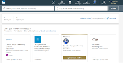
Not only this, but I have also been making use of LinkedIn and their job listing tab. This has been pretty basic in terms of suggesting animation jobs, as I haven't updated my profile since I made it. Once I update it, which I will do in the next few days, I feel that it will begin to start providing me with more accurate job listings that I can then begin to start cataloging and applying for. 

I will also get in touch with studios and practitioners to start conversations. Rather than asking for a job straight away, I will be sure to try strike up a friendly professional relationship first and possibly inquire about work experience, shadowing or day visits later down the line. I will also keep up to date with what local studios are up to and attend any festivals that I am able to. 

Studio Research: Boulder Media

Reflecting upon the work that I would like to do and where I'd like to see myself in the next 5-10 years from, I decided to expand my research to studios outside of the UK to Ireland, as this is somewhere I've considered working for the last 2 years because the animation industry over there is flourishing. So I began with Cartoon Saloon, but since I have done research on this studio before, it was just to check up on on their latest news and see what it was they were currently working on.

The other company that stood out to me whilst I was searching was Boulder Media. This is a Dublin based studio that works on variety of 2D and 3D projects for bing name companies such as the BBC, Cartoon Network and so on, as well having produced a number of shows including The Amazing World of Gumball, Wander Over Yonder and Danger Mouse.


Even though this studio is based in Ireland, it is definitely somewhere that I would consider applying to in the future, as I feel that it would be a great opportunity and provide me with a breadth of experience. Looking on the website, the studio appears to have a number of various job opportunities that are updated regularly, so it is something that I will keep my eye on. I will also get in touch with the studio, and ask them for advice on my showreel and just start a conversation.

Studio Research: Brownbag Films

Brownbag films is a studio that was originally posted in Dublin that appealed to me but was out of my reach fro the near future, as it would require me to travel to Ireland if I couldn't work remotely. However, they have recently branched out to Manchester, which a huge opportunity for me, as this is where I will largely be situated in the near future.

After looking into the studio, they appear to work on a lot of 3D animation, however, I know that they also work on 2D productions for other clients and it is this element of the studio that appealed to me, especially because they are right on my doorstep.


Also, their work appears to be aimed mostly at children, however, this doesn't bother me as much as I though it would, as the prospect of having a studio working on so many things so close to me is a lot more appealing. After doing some more research into the studio, I know that they are hiring 2D animators at the moment to work on a production for a "big client". However, the job does require you to have previous experience and knowledge of Toon Boom. Although I don't have the experience I need it would definitely be worth my time to get in touch with the studio and start a dialogue with them.

Studio Research: Karrot Animation

Karrot Animation is another studio based in London that really appeals to me in a long term future thing. The work they create is something that I would very much like to create throughout my career and as I was looking through my work, I found that there wasn't anything in particular that I didn't enjoy. Karrot focus on create character led animations and are best known for their series Sarah and Duck, which is an animation I personally enjoy.


The studio works on a variety of projects that include work with big name companies such as Turner, Nickledeon, Disney, CBeebies and Amazon, which is what I believe makes the company so successful. Not only this, but their eye for good character design and immersive environments also makes them successful, as they know their strengths and work with them to create work that is strong and entertaining.


Karrot have also worked on idents for Cartoon Network and other Channels, which again is something that I'd like to work on myself and could possibly do, especially for E4 as they provide a competition for their idents every year, which is something I will definitely look into this year or next.

Overall, despite this studio being in London, I could definitely see myself working for a company that produces work like this and using my skills to create work that is creative, entertaining and aesthetically interesting.

Studio Research: Cartoon Network

Cartoon Network is another one of those studios which I would ultimately love to work for one day, whether that is on a number of projects, or as a more permanent staff member, as I really enjoy their content and feel that their aesthetic, ideas and TV shows are straight down my alley. The only downside to this is that their main studio is in America, which is an option that isn't available to me right now, as I am rooted in the UK until I gain experience and money. However, that doesn't mean that I shouldn't research the studio or keep on top of the work they are doing, as there are many studios out there that work on the programmes they produce. 

Whilst researching the studio, I found that they have a studio down in London, which could be an option for me in the future. I also found that they offer internships in America, which again I won't rule off my list of possibilities in the future. 


I feel that this studio is so successful due to the wise variety of content it is associated with and audiences it reaches out to, from young children to adults with shows such as the Amazing World of Gumball and Adventure Time. 


Conducting further research, I found that Cartoon Network is a part of Turner Studios, which hosts a wide range of brands such as Cartoon Network and Boomerang, with them having a range of brands within the UK. 

Studio Research: Aardman and Nathan Love

We all know Aardman for it stop motion masterpieces like Wallace and Gromit, Morph and Shaun the Sheep, however, the studio also creates a range of 2D animations, mostly for commercial purposes, but it is 2D nonetheless. This actually came as quite a shock to me, as I wasn't actually aware that Aardman did any 2D work at all.


However, they do, and having a look through it I feel that even though it's commercial work, it actually appears to be quite narrative based or character driven, which is something I am definitely interested in. Although, I must admit, the thought of working commercially does put me off slightly, as I really dislike the idea of commercial work despite knowing that it pays the bills. Having said this however, it would be great experience and would definitely boost my portfolio.

This studio is very clearly extremely successful, and I feel that may be down to the studio specialising in an area of animation that isn't as popular as it used to be, which is stop motion. Within the UK there aren't that many studios which focus on stop-motion, preferring 3D over other formats. I also feel that they've done so well because they create such a large range of work and a variety of different work on commercials to feature lengths.
Their success is evident in the fact that they have currently branched out to New York with their studio Nathan Love, which focuses more on commercial work and creates more 3D work than stop-motion.


Seeing commercial work being done in this way has made me think about what work I would be willing to do and whether or not I could potentially find work within the commercial realm that I would be happy doing. Nonetheless, if push came to shove I wouldn't turn down work regardless, however, I'd be happier working in the entertainment industry rather than the commercial one.

Studio Research: Arcus Animation

Arcus Studios is a 2D animation studio based in Newcastle that creates broadcast animation, promotional videos, video installations, in-house original content and develops new IP. After scouring their site and watching their showreel, I found that although some of the content isn't what I'm looking to do, such as their motion graphics stuff and informative animations, there is also a lot of work that they create that also appealed to me. Although they work to create a lot explainer videos and commercial work, they also create a range of in-house productions that look just plain fun and creative, which is definitely more up my street.


Although the studio appears to be doing well, it is one I've never heard of before, so I was actually really excited when I found a studio that was primarily 2D based and it was in the UK! With me wanting to specialise and focus on producing 2D animation and narrative driven concepts, Arcus is definitely a studio I will keep my eye on. I will also attempt to get in contact with them to ask their opinion on my showreel and see what advice they can offer me about starting out in the industry.

Studio Research: Sun and Moon

Sun and moon is an animation studio based in Bristol that focuses on character driven animation that is done in both 2D and 3D. I came across this studio when I was researching studios in the UK and whilst it is in the south, I still found myself drawn to it, however, it may be a place I look further into when I have gained some experience and have the finance to move around freely.


Sun and Moon create work that focuses around inventing magical worlds for characters to live in and explore. They create work for both commercial and creative uses and have worked for a number of big name clients including Aardman, the BBC and E4. What drew me to Sun and Moon the most was their range of 2D work and seeing that their 2D work is extremely varied and consists of a number of different aesthetics and drawing techniques, which is something I haven't been seeing all that often in my other research. This gives me confidence that there are studios out there that work on narrative driven work, that isn't just for children or adverts, but for creative purposes too.


I feel that the variety of work they display across their website demonstrates why this studio is so successful. Whilst they will do commercial work and team up with advertising companies, the studio also engages in other work such as short form animation. They've built up a strong networking base to work from and have built a trustworthy reputation as a company, which will also provide them with many job opportunities.

Overall, I feel that Sun and Moon would be a place that I will definitely consider in my future and will put in my list of places to contact, as I feel that they are currently creating work I could see myself also creating.

Monday, 15 May 2017

CV and Cover Letter Workshop

In order to get us prepared for entering the industry, we had a workshop on how to write a standard CV and covering letter, as although these may seem simple, they are easy to get wrong and because they are the first impression, it is important to get these as right as possible.

We started with covering letters and covered the layout and correct etiquette to use when addressing professionals for a job. Although there wasn't much to cover we were given some useful tips:

- Always start with Dear...
- Never use I want or need
- Be grateful and appreciative and considerate.

- DO research before you email the company or person
- keep it short - 3 paragraphs (4 if you know them)
- Explain what you like about their work - butter them up, show interest in their work or company
- Be enthusiastic but not patronizing.

After applying we were told that it is okay to follow up your emails/ letters and that we shouldn't leave it any longer than 2 weeks. It is also important to thank those that respond, even if it's a no, as this will help to build a database of connections. Also, apply as many times as you can to as many places (even if it means for more than one position at the same place). It could be helpful to create a spreadsheet of the places you have applied to, or want to apply to, as this will keep you motivated and help you apply to as many places as possible.

Finally, end an email with "looking forward to hearing from you" as this prompts a response as no one wants to be rude.

The workshop then moved on to inform us what to do if we get a call back for an interview or a chat. Even though it may be a job interview, you needn't dress too smartly, smart casual will be fine so long as you are comfortable and well presented. You should also go in with a positive attitude and one that demonstrates that you are passionate about working for the company and animation in general. And it goes without saying, but you should always do your research and show enthusiasm over your own work and where you intend to be in the future.

With the first part of the workshop over, we moved onto writing a CV. This is something I've never really written before, so I found the workshop to be extremely useful and I feel that it will aid in me writing a strong CV in the future to send out with job applications. Again, the workshop was a series of tips and tricks like the others have been that were all extremely useful. In order to create a strong CV you must:

- Sell yourself, it is a first impression and will give an employer a good sense of who you are as a person.
- Be succinct and precise, your CV should be no longer than 2 pages.
- Keep your address broad and your name and contact details clear.
- use dashes or spaces between your mobile number as it makes it easier to remember.
- Use your personal email address, not your student one.
- Your personal statement should be lively and succinct. You should avoid cliches such as hard working and works well in a team, as these should be obvious.
- Make sure to include any achievements you have made outside of university, it shows interest outside of uni and gives an insight into your personality and personal life.
- List relevant skills, experience and ambitions that are appropriate for the job.
- DO NOT LIE
- If it's working knowledge of a programme, don't put expert.
- Make use of placements, commissions and internships.
- List education with the most recent first, but don't list all A-Levels and GCSEs, simply mention how many you have and at what grade.
- Be specific about your hobbies and interests, it'll be a talking point.
- Always ask if it's okay to put someone down as a reference and state that you ca provide references on request.

Overall, I'm really pleased that we got the chance to attend these workshops, as I feel that I have gained a lot of useful knowledge that will help me to build a professional portfolio that I can begin to use as a gateway into the industry.

Showreel Advice

Showreels are something that we all have to create being creative professionals, yet they are often one of the hardest things to get right, as so much is relying on you getting your showreel right in order to land that dream job. Which is why I found this workshop to be incredibly beneficial as it demonstrated the best ways in which to make a showreel and offered us advice from creative professionals, which I felt has given us a good shot at creating the best showreel we can for industry. 

First off, we were reminded to keep it plain and simple, not to spend lots of time making a fancy name and intro, but to rather get into the action straight away only holding your information for around 3-5 seconds. We were also reminded to keep this information clear and understandable. 

The next few tips revolved around the content of our showreel. It is important to think about your work and what works best to your strengths and showcases what you are capable of. Put your best shot first and refrain from padding, as this can cause a viewer to become disengaged and bored with your showreel, which should be no longer than 60-90 seconds. Similarly you should only include what you are good at rather than things you are merely okay at. You should also try to demonstrate that you are flexible and adaptable throughout your work. Showcasing only one type of animating limits your abilities and may cost you the job so think about how to showcase animated performance which can be done through concept art, story-boarding, model making, etc. 

 Following on from this, you should clearly explain your role through your work. For instance, if you merely did the backgrounds within a short then you should articulate that this was your role and that the animation within that clip isn't yours. Explaining or showcasing the roles you played may differ depending on which studio you are applying to, as different studios will be looking for different things, so it may be worth creating a general showreel for social media and then creating specific ones for applying for jobs. 

It is also important to carefully consider audio for your showreel, as the right music will effect how your showreel is seen. It is actually surprising to hear that many studios listen to your showreel with the music turned off, so be sure to select something neutral, as this will be more pleasant to listen to if they do have the sound on. 

Finally, it is important to ensure that all links work to your work and that you keep updating your showreel regularly. A good rule of thumb is to have at least a bi-annual update of your showreel, as this shows that you are engaging within the practice and keeping up to date with animation and learning new skills. 

How to Get Paid! Invoicing Workshop

During this workshop we were given an insight into invoices and how to set one up for when working with a client. There isn't much to an invoice, but it was nice to have the workshop regardless, as sometimes it is easy to forget how to do the essential things, such as setting up a correct invoice.

When creating an invoice, it's important to remember that they don't need to be all flashy and fancy, but it is in fact better to keep them simple and clear.
To start with you should have a clear heading stating INVOICE, which should be followed by your name, the name of your company, branding and trading name (which can be anything) and the date. Finally, the top of the page should contain the invoice number, which you should start at 00000001 and work your way up. This way it is easy to keep track of all of your work for future reference.

You should then move on to state the payment terms which is typically 14-30 days from the date of issue, but either way, you should be clear of when you want the payment, followed by your name and address.
The remainder of the workshop followed suit, reminding us to include the clients name and address, the amount owed, VAT if you needed it, although this only applies if your turnover is £830000, and most importantly your bank details.

Again, I feel that this workshop was aimed mostly at freelancing, however that isn't to say it hasn't helped me in any way. Even though I am not looking at being a freelancer at this stage, it is still useful to know and I am confident that I will be able to use this knowledge later in life.

Contracts Workshop

In this workshop we went over the importance of contracts and why it is essential to have one set up whether you're going to work for a company or whether you're working for a client. Although it is important to have a contract with a company, I believe this workshop was aimed more at freelancing and how to protect ourselves when working with our own clients. 

The tips we received revolved around:
- making sure that the contract is clear and coherent.
- clearly explaining any upfront costs and the terms of your invoicing.
- identifying what you will be providing and what your needs from the client will be.
- Articulating any additional fees.
- Explaining how long your quotation lasts for. 

Not only is it important to make sure that you explain these things to your client clearly, but it is also important to inform your client of how long the job will take and where milestones and feedback will be given throughout the project. This will help to manage your clients expectations and control turnaround times feedback for changes. 

We were also given advice on what to do if we needed to make changes and who to contact for such circumstances. We were also told that it is important to gain permission from the client if the job goes over budget, as they may not be able to afford it and may ask to terminate the contract. Not only this, but it is important to sign off with the client for each stage of the project, to ensure that you are covered and aren't breaking any agreements you made. 

However, sometimes things don't follow through as they should and the end of the workshop went through how to cover ourselves if things don't go as planned.
It is important to keep these things in mind:
- Clearly articulate what you are getting paid for. You don't want to lose out on payment for work you have already completed. 
- make it clear from the beginning who owns the rights to the work completed. 
- Seek legal advice if you are unsure, but you should consider legal costs if you wish to do so. 

Finally, it is also important that you make it clear between you and your client that it is okay for you to use the work you created for your own promotional benefit, and if so if there is a best to use from date. You should also make sure that your client agrees to keep aspects of your work under wraps before, during and after the job, in order to protect you financially and professionally. Finally, you should consider if you would charge your client in the future if they wish to re-purpose your work or notice any mistakes after completion. 

Overall, I found this talk really helpful despite the fact that I don't intend to work as a freelancer at the moment. Having said this however, it was really good to have this information given to us, as I feel a lot more confident that I know where to start should I ever need to create a contract for a client. It has also given me an insight into how companies would work with clients and I feel as though I am a lot more understanding of the procedure and how work is undertaken for outside clients.