Reflective practice is a way of looking work created by yourself and being able to critically identify what you are doing, how well you are doing it and where you sit within your practices community. It involves you thinking about what you have done, why you have done it and what have you leant from your experience. It's quite clear that this is a very important element to any creative process, as it allows us to identify our strengths and weaknesses and what we should improve on or actually avoid doing again.
In the presentation, we were shown Gibbs' reflective cycle, which I found to be extremely useful, as it gave me a guide on how to effectively reflect upon and criticise my own work and working practice. This is something that I should keep referring to whenever I have to reflect upon and evaluate my own work, as it will help me to pick out my strengths and weaknesses within my work.
During one of our PPP lectures at the start of the year we were given a presentation on how to create an effective presentation, which I have found to be extremely useful to me throughout this course. Throughout the presentation we were told that it was key to know your audience and remember that a presentation is to inform those you are presenting to about your work, who you are, what you are doing, etc. and that it shouldn't be about you and most of all it shouldn't be stressful. Other points were made that were very straight forward and should be common sense (e.g. don't put too much text on a slide, don't use harshly coloured background, make sure the text is clear, etc.)
The presentation then went on to remind us that it's key to be prepared and that if you are prepared it will be a breeze. All of these tips have proved to be extremely beneficial to me when I have come to give a presentation and because of them I have been able to give a presentation with little stress and worry.
This is a short animation that I found whilst browsing the internet for nothing in particular and I decided that I had to talk about it. The story follows the life of a rock, which seems as though it would make a boring story, however, it's not at all bad.
But the story isn't exactly why I was drawn into this animation, but rather it was the method used to create this animation. It was created using digital animation over water coloured backdrops. Again, this demonstrates a different style of animation that I'm not at all familiar with, but realise that I actually really love. I like the different colours and shades that are created in the backgrounds that are unique to watercolours and I feel that the use of watercolours give the animation a wonderful overall aesthetic.
Another thing I like about this animation is the story. Although it's about a rock it's actually really cute and clever, which again, it reminds me that sometimes all you need is a simple story that's outside the box to make a successful animation.
This is an animated short that I came across whilst browsing through the website loop de loop that was submitted as a response to the word 'childhood'.
I decided to put this on here because I thought it was great example of how an idea can be generated from a single word and it demonstrates really good idea generation and development, which is an important aspect of the animation process.
Not only that but I found the style and aesthetic very nice to look at. It's not something that I would usually look at and it's not a style that I would ever consider using, however, I do feel that it works really well and that it conveys the idea of childhood really well too. The style is very sympathetic to the tone and mood of the subject, which is also really important when creating a successful animation.
Another thing I like about this animation is the idea itself and how it's been executed. I really like how the bedroom transforms into this little imagined world of the little girl and I feel that it very clearly displays that what the little girl is imagining.
Overall, this is a beautiful little short that has made me think about how I approach ideas in the future. I don't necessarily have to make things complicated or spectacular it's all about thinking outside the box. It's also made me think about my own personal style and it's made em realise that I'm still not sure what this is and it would beneficial to me to start experimenting with more styles.
When I mention Scooby - Doo I mean the animated feature lengths and not the animated TV series or the live action films (lets face it they're pretty poop). The animated films however, are not poop at all. In fact I find them really fun to watch and I think that environments within them are actually really good.
Scooby - Doo and Zombie Island
Scooby - Doo and The Witches Ghost
Although I struggled to find any good examples of the environments within any of the Scooby - Doo feature length films, they are there, you just need to look past the characters and take a minute to look at the environments the stories are taking place in, you'll realise that they are actually quite detailed and well drawn.
Scooby- Doo and The Cyber Chase
Scooby - Doo and The Lochness Monster
Although I'm a fan of most of the Scooby - Doo animated films, I must admit that Scooby - Doo and Zombie Island is by far my favourite. This is simply because I love the environments within the film and I'm a sucker for the storyline (plus the songs are really catchy). But it's mostly the environments. For something that many people associate with the low quality TV series, it has to be said that this is a huge step up from that and I feel that contain some really good examples of an effective environment.
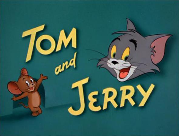
Tom and Jerry was an animation that I absolutely loved as a kid. Now not so much. When I was younger it was all about how the animation made me feel. I had a strong love for Jerry whilst I didn't want Tom succeed in ruining Jerry's mission for cheese. However, now that I am older I realise that I was very fond of the style and aesthetic of the Tom and Jerry that was aired when I was a little girl.
Tom and Jerry The Movie
Looking at today's Tom and Jerry I feel as though the character and the personality of the characters have been stripped away to leave behind this empty shell of what I used to love watching as a kid. However, although I don't like the new version of my childhood TV program, I do feel that it is a great example of how animation styles change and differ over time and it reminds me that it is important that I am versatile with my own work.
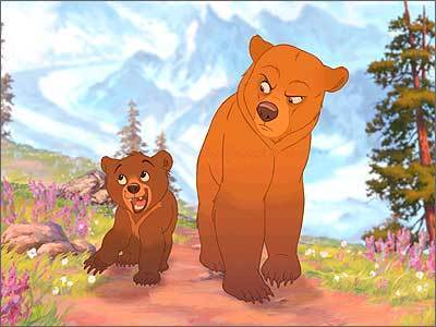
Brother Bear is another film that I watched as a child that I still watch today because I find the whole thing to be beautiful. Not only do I find the storyline beautiful, but I really love the character design and the environment design too.
Although created in the typical Disney fashion, I really like the aesthetic and the appearance of the characters within this film, as I feel that they fit really nicely with the environments and their personalities. In particular I love Koda's personality the best, as I feel that it is very similar to mine as child, which only makes me love the character more. However, I do feel that the characters within this film have their own personalities that help to create their own appeal, but I do feel that there are a number of characters that wouldn't stand out if they were on their own.
Despite that flaw however, I find the environments very beautiful. I love the amount of detail within them and the colours used and I feel that they capture the mood and tone of the story really well. Brother Bear is a film that makes me think about how character and environment design should work together to create a successful visual appeal, which encourages me to experiment with more environment designs with my free time.
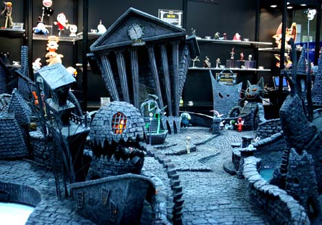
The Thief and The Cobbler is an animated feature that was created, but never actually finished, by Richard Williams. I decided to talk about this animation because of the pure creativeness that is displayed throughout.
Although this animation was never completed as planned, I still find it astonishing at what was achieved for this film especially visually. Throughout the animation there are a number of various backgrounds that are, for a lack of a better description, animated optical illusions. The fact that such complex patters have been used for backgrounds on such a large scale impresses me enough, but the fact that they have then been animated just blows my mind. It is very apparent to me at how much time and effort went in to creating this amazingly wonderful piece of animation (or should I say pieces?) and it has made me realise what can be achieved when you put all of your dedication into making something look visually amazing.
This is a film I haven't seen for a long while but I can still remember the majority of the storyline but that's not the only reason I love this film. To start with I really like the environment design within this film.
Although this is a Disney film, I find the art style to be quite different from the majority of other Disney films. They are often quite simple designs made beautiful with complex colour shadings, which I find quite refreshing to look at, as although the majority of Disney films look beautiful and amazing, I find it very easy to watch the more simple designs found in The Emperor's New Groove. I also love the colours, they are very vibrant and 'pop' when the mood of the film requires it and they turn to deeps shades of blues, greens and purples when the villain is on screen, but all of the colours regardless of tone and shade are still very strong and clear.
Another thing I like about this film is the character design. Again, with the majority of Disney films, you find that the characters are quite realistic, they have realistic body shapes and they usually have a good amount of detail to them. However, in this film I find the character design to be quite simple for Disney. I mean, you can still tell that they are made by Disney, but I feel they have a much more 'cartoony' feel to them. I also like the variation in the body shapes and sizes, as it gives me something new to look at each time without all the characters looking very similar.
The last thing I want to mention about this film is the way the story is told. I really enjoy watching films that have a new and refreshing way of telling the story and I feel that this is a rare Disney film that does just that. The characters actually engage with the audience throughout the film and actually speak into the camera. For me, this helps to break the story up and makes it all that more enjoyable to watch, as it really draws me into the story and makes me feel as though I am a part of it.
How To Train Your Dragon is a film that I can't say I've watched all that much compared to other animated films. I guess I'm just not that big of a fan of the storyline. Having said that however, I do really like the range of characters that are in this film simply because I find the different body shapes and sizes amusing to look at. I even find myself being drawn more towards the quirkier design characters then I do the main ones, as I personally feel that they have more appeal due to their funny body shapes.
Another thing that draws me into this animation is the personality that is captured within each of the characters and in particular the dragons themselves. Although they don't have the ability to speak they still have really strong individual personalities that reflect their owner's personality. My favourite dragon has to be Toothless without a doubt, as he has the most vibrant personality and makes me laugh.
Overall, I feel that this film is a great example of character appeal and demonstrates how important it is for a character to have personality.
Sticking with the stop motion theme I want to talk about A Nightmare Before Christmas. This was one of those films that, as a kid, I was always a little freaked out by it but I would always end up watching it again and again and as I got older I began to love that the film was darker than many of the other animated films I would watch.
However, I feel that it was the set and puppet design that drew me into this film the most. Stop motion animation was what got me into animation in the first place and although that might be changing now that I'm learning more and more about animation, I still can't help but be drawn in by the beautifully hand crafted sets and puppets.
I also really love the aesthetic of Tim Burton's work and how the environments look realistic, yet completely made up at the same time. I feel that the sets help to transport you to a different world where you feel as though it might just be possible that somewhere like this exists.
Stop motion is something that I haven't experimented with as much as I'd have liked, and films such as The Nightmare Before Christmas definitely make me want to practice it more.
So in the end, I realised that I hadn't planned my time very effectively and this meant that I was getting a little stressed, as what I wanted to do wasn't very realistic in the time frame that I had. This also resulted in me Rotoscoping the whole animation.
Although this wasn't what I quite had in mind, I'm not at all that bothered about it, as I was doing this to experiment with something new and to focus on creating motion through animation, which I have done. I am a little disappointed, as I didn't get the chance to practice my drawing skills, however, I will have plenty of opportunity to do so later on.
Because of the tight time frame I left myself with, I also haven't been able to add in the hands for the majority of the frames, meaning that for the most part the dancer has no hands. However, when I watch the animation I don't feel like it ruins it as such, but it would look better overall if all he frames had the hands. I also haven't had time to think about a backplate, but personally, I like that it is just the white on black dancer within the animation. Yet I am aware that some people don't agree with this and I will consider a backplate for the exhibition.
Overall, I am really pleased with myself for learning a new skill and for producing an animation such as this in such a small time frame. Although this animation isn't the best of quality and there are a lot of things that need improving, I am still quite happy with the results.